Yes, I got an Apple Watch. Sorry, Watch.
And people want to know. What is it? How is it? Is it any good? Is it worth the money? All reasonable questions. I’ll answer them as best I can. Once again, there’s already way-too-much written about the Watch all over the internet. I’m not going to rehash professional reviews, that do it much better than I ever could. I’m just here to give my opinion.
In that vein, I’m going to completely gloss over lots of functionality. I don’t have bluetooth headphones, for example, so I don’t care about the Watch’s ability to play music standalone. I’m never far enough from my phone that I will care about the Watch’s independence. I’m fine with it as a strict accessory to the phone. I don’t use Maps for directions (although the Maps on the wrist are kind of cute). This is strictly based on what I’ve actually used and done with the watch.
What is it?
It’s a watch.
No, seriously. It’s a watch.
 In 2015, these things on the right aren’t “Smartphones”, or even “iPhones”. They are phones. This is what I think of when I think of “phone”, or say “let me grab my phone”. I don’t mean a rotary-dialed, black, heavy, wired monstrosity that my kids have never seen. Those are antiques. A phone, in this day and age, is a pocketable computer with a mostly-glass face, ubiquitously connected to the Internet, which happens to enable voice communications several different ways. VoLTE, VoIP (FaceTime, Skype, Google Hangouts, Facebook messenger, etc.), GSM calls, it doesn’t matter any more. It allows me to communicate with people, in a ton of different ways. One of them happens to be backwards-compatible with earlier wireless voice communication technology. It won’t even be around for a lot longer.
Phone numbers are weird and antiquated. Soon we’ll have to resort to explaining historical background to tell the young’uns WHY phones have numbers at all. “Well, it was like an IP address…”
If I could go back in time and tell tech-loving 20-year-old me in 1994 that I’d be carrying around a 64-bit pocket UNIX computer with a 1920×1080 color screen, based on the NeXT OS, permanently connected to the net, at speeds MUCH FASTER than the best Ethernet could accomplish then, with AN ENTIRE GIG of RAM, and a battery that lasts all day… I don’t know. I would’ve punched myself for lying, I guess. It is just too good. Then I’d tell 1994-me that we call these things “phones” nowadays, and act all cool like it’s no big deal. And 1994-me would probably try to steal my iPhone, morals be damned, and then go all sad because it couldn’t get a signal, and what the $#!^ is the strange port on the bottom, and WHY DO YOU TIME TRAVEL WITHOUT BRINGING THE CHARGER… But I digress.
The Watch -terrible name- is a watch, in the sense that the glass-and-aluminum slabs we carry around are phones. It’s just a circa-2015 attempt at making a watch, by the most successful tech company in the history of the planet (believe that, 1994-me!).
And it’s beautiful.
The pictures of the thing, even those meticulously-photographed or rendered 360º views on the Website, don’t do it a lick of justice. There, it looks thick, unwieldy, and the proportions seem a bit off. In person, those concerns disappear. It’s smaller than it looks in the pictures; or, at least, it’s the right size for my wrist, at 42 mm (the larger of the two versions).

The observant reader will notice that I got the stainless steel “black” model. I won’t go into details. It wasn’t a rational decision*, but I believe it’s the best-looking of the entire bunch, by far. Feel free to disagree. That’s the whole point of the large number of offerings and combinations.
Also, I’m not becoming an WristModel any time soon, not without a lot of shaving and trimming, and a shirt from somewhere fancier than CostCo.
I guess that the difference lies in looking at it from a normal “looking at my wrist” distance, versus the close-up pictures that a small product like this demands. You don’t look at it from a couple of centimeters away, normally. You look at it from 30-50 cm away. At that distance, it looks great.
How is it?
Well made. Insanely well made. is making this manufacturing prowess an everyday thing, so we take it for granted. It’s even better made than the iPhone 6+, which is a ridiculous statement. The Stainless Steel Watch is heavy, much heavier than it looks, and has that dense “quality” feeling you get when closing the door on a large Mercedes-Benz. Thunk. It’s a bit clinical, but it exudes Quality. Like many other Designs, then, if they were made of surgical steel.
People complain that the software is complicated and unfriendly. I disagree. It takes a little bit of prodding around and poking on the UI, but it becomes second nature in a few hours. Now I just use it without thinking about it. Yes, there’s a couple of things that still aren’t 100% intuitive, and the extra button on the side could be used for something else; I don’t think I’ve ever pressed it to accomplish something other than turning the watch on. It doesn’t bother me that it’s there, being useless. I suspect it’ll come into its own when more people have Watches and communications becomes a more central function…. or it’ll be reassigned as a “home” (or possibly “Siri”) button in WatchOS v2.0 and we’ll be better off for it.
In that sense, it’s a typical Apple Rev A product. Wonderfully made, with some obvious glaring shortcomings that will be fixed in Rev B and make me look like a fool for buying a Rev A one. Oh well. Someone had to.
The real complaint, I think, is discoverability. The Watch is not immediately obvious. If you’re used to breaking ALL THE POTS in videogames to see what’s inside, or poking around a computer to figure out how to do things on it, you’ll have no problems with it. It’s easy. If you expect to be held by the hand and guided around, you might have trouble. Force Touch, where you touch harder to bring out different functionality, is only obvious because everyone’s written about it. It’s like a right mouse click. If you grew up with PCs with two or three-button mice, it’s obvious. If you’ve never used a mouse before, there’s no reason you’ll intuitively understand that the buttons do different things. The same applies here. You have to be willing to experiment. If you do, the Watch will become second nature in no time.
Ok, ok, but how do you USE it?
You look at it.
That’s most of the use cases. Twist your wrist to look at your watch, and the time’s there. Also a number of other small pieces of information, depending on how you’ve configured it. The outside temperature. Your activity level so far for the day. Your next appointment/meeting. How much battery it has left. The date. These are called “complications”, in a nod to traditional watchmaking. Sorry, I meant horological timepiece craftsmanship. The watch world is obnoxiously pompous.
When you get a notification, the watch will by default “tap” you on the wrist, sound a gentle tone, and you can… look at it. You can tap on the notification to dismiss it, or reply (if it’s a message) using canned replies or Siri. It works pretty well.
You can also set the notifications to display a general message (such as “Message from John”) instead of the actual content, for privacy reasons. Then you tap on the notification to see the contents. I’ve set it up this way. More taps, but less information leakage at inopportune moments.
As to the “taps” courtesy of the “taptic engine”… I think there’s something wrong either with me or my Timepiece. I feel them more like vibrations than taps. I’ll ask Support at some point.
You can also press the “Digital Crown” (if ’s guilty of anything, it’s too much deference to Horological Bouse De Vache) to bring you to the sorta-homescreen, with app icons. It’s easy to navigate around by swiping and tapping on apps. Here’s where you’ll also learn about First Class and Second Class Citizenship.
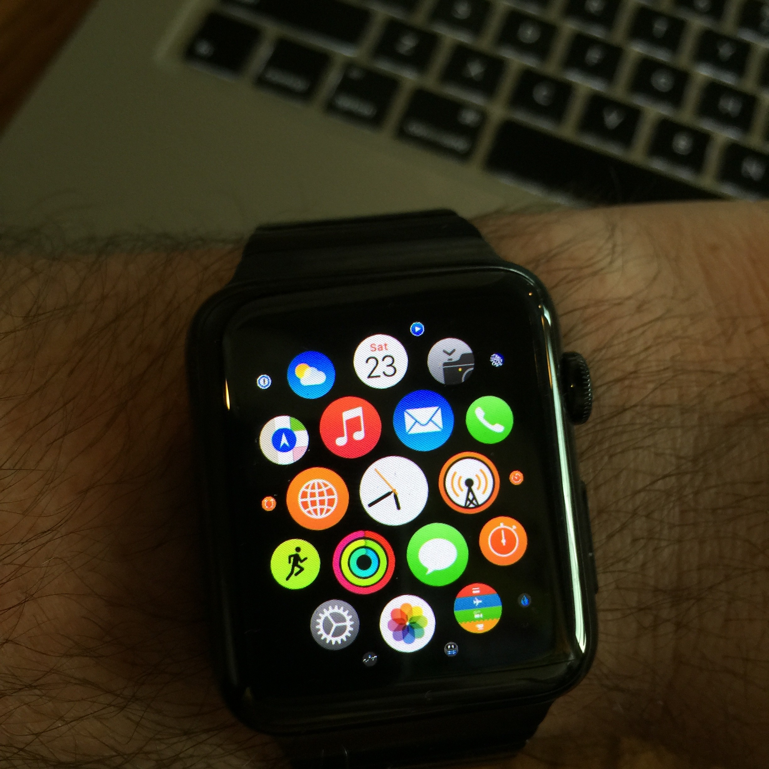
First Class Citizenship is bestowed by and alone, on its own apps, built using an unpublished and not-yet-available SDK. When you tap on an app, it opens immediately and works well. Second Class Citizens are apps written by unwashed third-party developers on ground not as hallowed as Cupertino’s. They are actually remote displays for code running on the phone.
When you tap on a third-party application, something like this happens:
Watch: “Hey, Phone, wake up! The user wants to run an app!”
[Time passes]
Phone: “I guess that could be ok. Which app this time?”
[Time passes]
Watch: “Dunno… Let’s say CalcBot.”
[Time passes]
Phone: “Ok. Let me look it up.”
[Time passes]
Phone: “I found something. It seems to have a bunch of code inside it meant for you. Let me execute it now.”
[Time passes]
Phone: “Hey, I got something for you! Would you mind displaying this?”
[Time passes]
Watch: “Huh? You talking to me? Display what? Oh, A SCREEN? For the user? We are still doing that? Ok, I guess.”
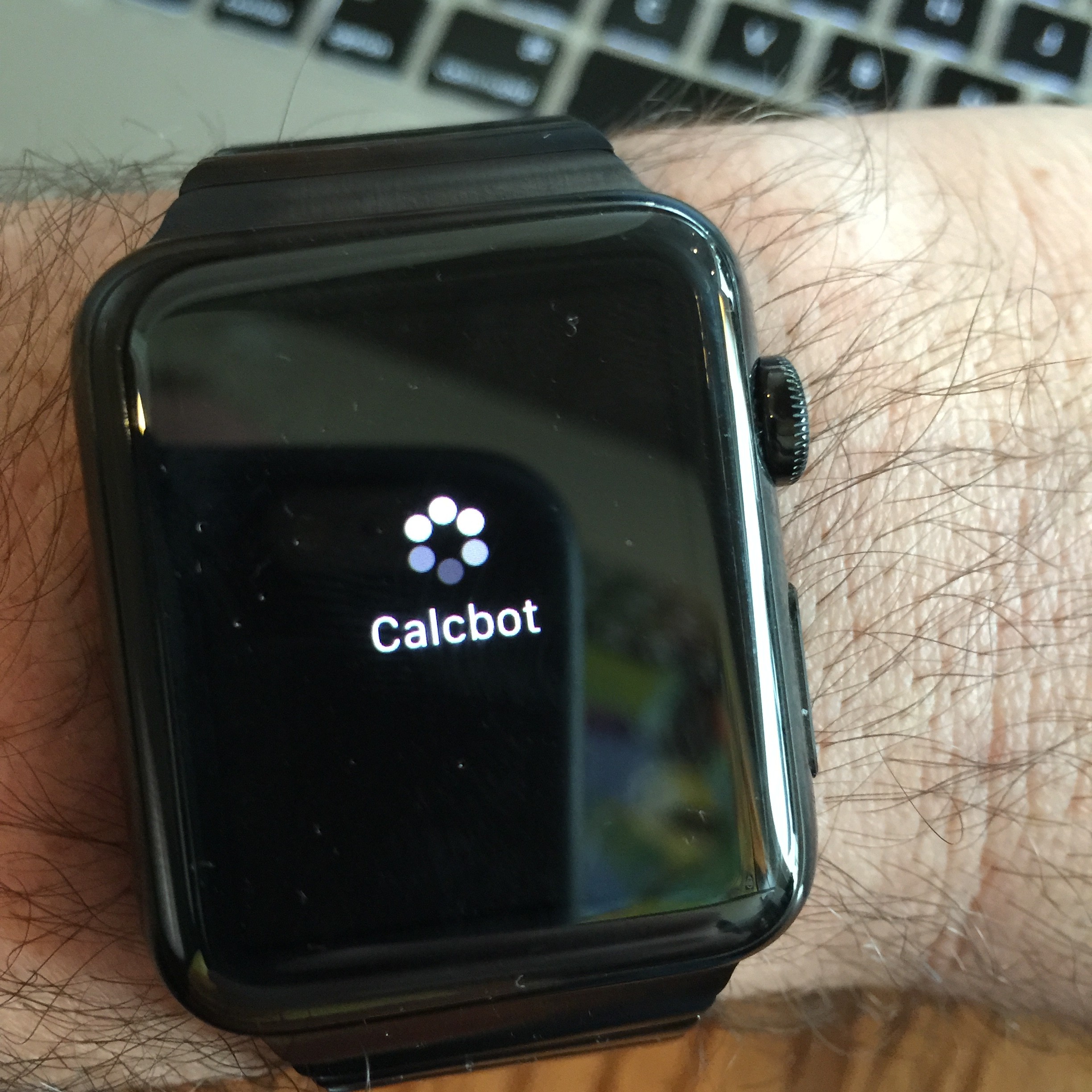
Have you tried to stare at your watch, which, annoyingly, has a pretty aggressive screen-off timeout to save battery, for 15 (“fast” apps) – 45 seconds (“slow” apps) while holding up your arm? It’s not pretty. This takes FOREVER. The screen turns off in the middle, so you have to flick your wrist back and forth. Or tap the watch. Several times. It’s foolish. It’s incomplete.
I could complain about it more, but let’s say third-party apps are unusable right now. Native apps are coming at some point in the future, much like on the original iPhone. Today, they might have been better off launching without them. It’s that bad.
Fortunately, the first-party apps are quite good, and enhance the Watch’s purpose of Being A 21st Century Watch. The usual Stalwarts are there: Stocks, Weather, Messages, Calendar, Mail, Music, plus a few Watch-specific ones. The central, and most obvious one, is… Watch. When in the home screen, press the Crown to center on Watch, then again to open it. In other words, no matter where you are, pressing the Crown enough times will get you to the Watchface, which is a perfectly sensible design.
That the watch is meant to run mostly as a Watch is also obvious when you notice that Glances, quick views accessible by swiping up from the bottom of the screen, only work inside the Watch app. These are somehow quick, and even the third party ones are quick…ish, so they sort-of-work.
The Digital Crown
A nicely-balanced scroll wheel for your wrist. Sometimes I wish it were just a tiny bit heavier. Sometimes I wish it clicked when turning. It works fine.
Unlike apparently everyone else in the world, I have 0 issues scrolling content with my finger on the screen. This was supposed to be A Big Deal. It isn’t. Maybe I’m too used to multitouch, or maybe it’s that the wheel doesn’t provide a complete interaction model. You’ll still have to tap, slide fingers, Force Touch, etc.
That said, in the few places where the Digital Crown is the only to interact (such as choosing complications, or selecting a color for the second hand on the Utility face), it makes perfect sense and works great.
I don’t know; maybe I was expecting The Second Coming of Engelbart, and the revelation of a completely new interaction model. The crown Just Works, which is both impressive and slightly boring.
The fitness tracker
The fitness tracker is pretty standard, as these things go, but on one hand improved by the great screen, and on the other hand too simplistic for true fitness buffs. For me, it’s more than I need and a lot better than my previous fitness tracker, a FitBit One. The One was quite good but I kept losing it. I had to buy it again. I own three now, and they are… somewhere.
The Watch’s main strength for me is being a LOT more in-your-face than a FitBit. It will tap you on the wrist once an hour and tell you to stand up and walk around, which I do. It will sit in a corner of your watch face, if you want, being slightly judgmental. Well, yes, you stood up… but have you EXERCISED? Have you? Even then, the default goals are modest: stand up at least once an hour 12 times a day; burn 500 calories “while moving” (even a sedate walking pace seems to qualify); and exercise 30 minutes a day, which is recommended but tougher for office-bound people like me.
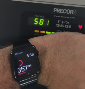
The Watch knows your age, height, weight, kind of exercise you’re doing, how much you’re moving, and instant heart rate. The latter is sampled intermittently, unless you open the “Heart Rate” glance, which monitors it constantly. All these should be able to power a fairly detailed model of how many calories you’re burning. Which can lead to some very nasty discoveries… like that your favorite elliptical lies. Blatantly.
I suspect that the Watch lies, too, but since it knows more about you and the software is written by software engineers, I’ll assume its estimates are better until proven otherwise.
I can’t speak to the running trackers. I don’t run. The elliptical and “general standing-around-and-puttering” seem to work fine.
The UI for the tracker (captured from my iPhone below, but the Watch’s is very similar) has a brilliant piece of data visualization. Each band represents one of the goals: Outermost Red is Move, Middle Green is Exercise, and Inner Cyan is Stand. As you can see below, I exercised a lot yesterday, but not today. The bands wrap around visibly when you pass your goals, which I found surprisingly encouraging.
The Camera Remote
This turned out to be surprisingly good. It’s like a Selfie Stick, with two important improvements: 1. It doesn’t look douchey (i.e. you can set down the phone somewhere, no need to use the stupid stick), and 2. it lets you use the rear camera. The one that actually takes GOOD pictures. You stare at your watch screen, and can trigger a photo instantly or with a 3-second delay. The watch screen is not a very good framing viewfinder, due to its shape and size, but it does the job just fine.
The Watch Faces
You can use any Watch face you want, as long as it’s provided by Apple. For now. Maybe. Or maybe not. No one seems to know.
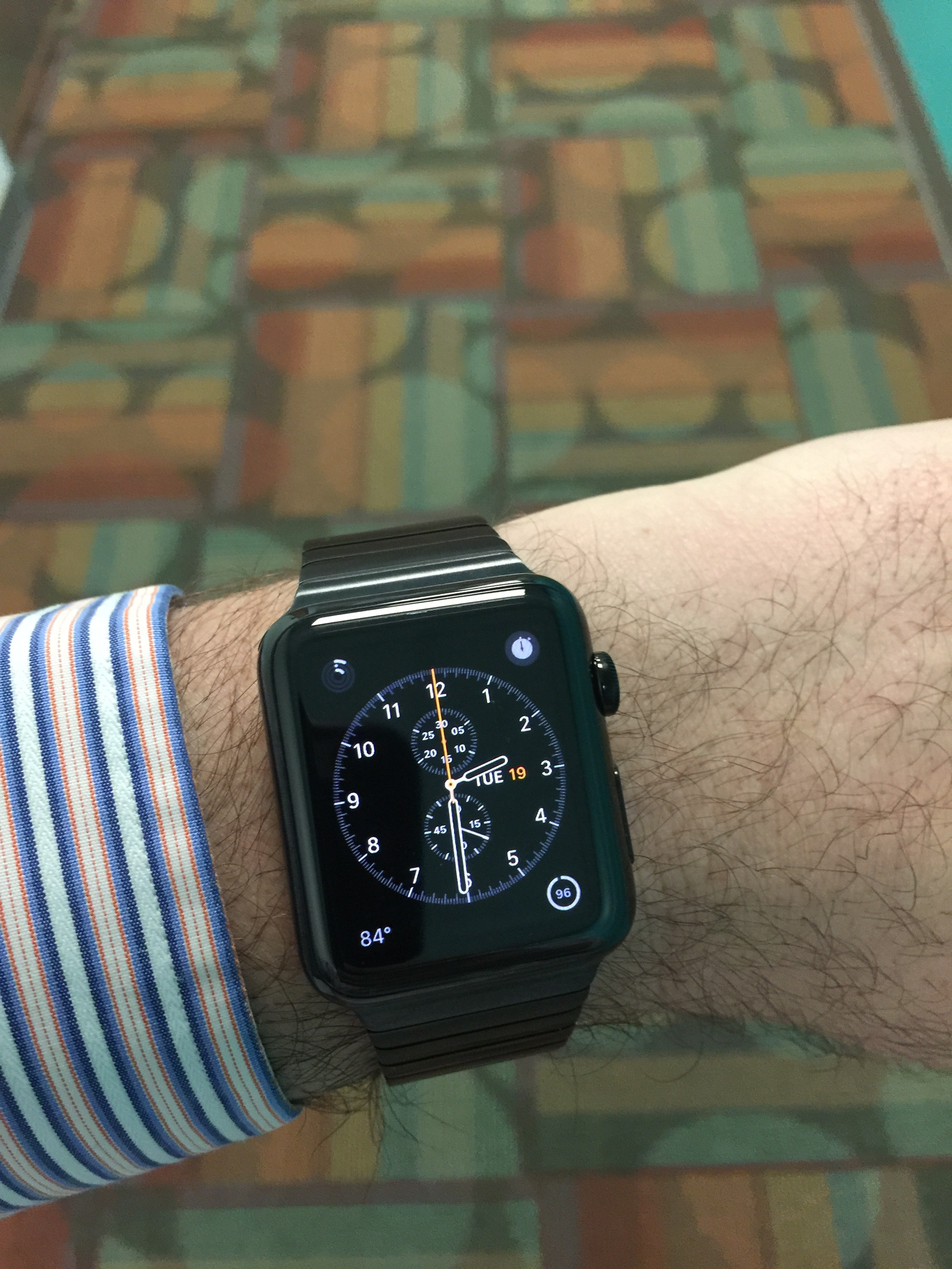
They are all beautiful in their own way, some weird, some very weird, some cute, and some utilitarian and very watch-y. I find myself drawn to the Chronograph face, which you see above. Yes, Mickey Mouse is there, and he’s perfectly animated, and taps his foot adorably every second, and is perhaps too cute.
You can customize the faces plenty. Add or remove numbers and marks; change the colors of certain elements; add, move, or remove complications in different parts of the UI. Some of the faces do things. Mickey taps his foot; the Astronomy face can zoom in and out of the solar system and show you the state of astronomical bodies at different points in time; the Motion face will show you a pulsing, glowing jellyfish swimming in a meaningless void (I did say weird, didn’t I)?
To take some of the sting out of the lack of third-party faces, you can save faces customized the way you want them. So you can have two different Chronographs, for example, one with a white background, exercise tracker, battery capacity, and a different one with a blue background, world clock, upcoming appointments, and weather.
There’s enough choice there to personalize the Watch pretty deeply, within the Sandbox. However, If you don’t like any of the Defaults, or don’t think you can tune one to your liking, this product isn’t for you. Much like on a 19th century mechanical watch, you can’t change the face[s] it comes with.
Some reports claim that third-party complications may be coming. That would be great. I’d love third-party watch faces, but I’m not going to hold my breath waiting for them.
Is it any good?
Yes, it’s quite good, if you take it at face value. It’s a watch with enhanced functionality. It’s a luxury product first, I suspect, which just so happens to be able to do more by talking to your iPhone. Infuriating shortcomings? Third-party app performance, which is unacceptable. Other things that fit under “is it any good?”
Battery life
Yes, you’ll charge it every night. That said, I’ve made it to the end of the day with between 20 and 50% charge left, depending on usage. I’ve not ran out yet. I don’t think nightly charging is a big deal. Every night, I plug my iPhone into its charger. Now, next to it, I put the watch on its magnetic dongle. Takes an extra five seconds.
Fit and finish
As I said above, insanely well made. The materials feel top-notch, and it looks built to ridiculously tight tolerances. The links in the bracelet are all IDENTICAL. The latch mechanism locks into place solidly.
Originality
I’m of two minds on this one. It’s a product made by the largest consumer electronics company that has ever existed. It’s expensive. As such, it gets -100 coolness points immediately. Pebble did it first. I wore a Kickstarter Edition Pebble for a while, until the display died and its band cracked. Android Wear did it before, too, and does some things better. Hell, Microsoft and Timex made a smartwatch of sorts. In 1994.
That said, there are some much-welcome innovations to Watchland in the Watch. The changeable bands – so easy even a klutz like me can do it, and they lock into place seamlessly. I got a sports band, for sportsing. It’s “cheap” (meaning it costs $49, which will buy several perfectly serviceable digital watches), but it feels great.

The Stainless Steel link bracelet – you can add and remove links using only your fingers, but they stay solidly in place. It’s brilliant. It comes with a little velvety pouch to store your unused links. It feels like a true luxury product. Which it is, so it’s good that it fulfills that part of the bargain.
Usefulness
I look less at my phone. Sometimes a lot less. And I’m not fiddling with the Watch constantly, either. I’m just not suffering from missed notification anxiety as much.
Siri on the watch is surprisingly useful, and has picked up a couple of tricks – it auto-detected that I text my wife in Spanish, and expects Spanish there, but English when texting my coworkers. Very nice, and something sorely lacking from the phone implementation if you’re multilingual. This, and this alone, has made it tremendously useful for me. I can use Siri now. I really couldn’t before.
It’s a narrow use-case, but it’s mine.
Otherwise, the standard smartwatch advantages apply. I can glance discreetly at my wrist and keep up with what’s going on. I can even send some replies. It reduces notification anxiety. For that, you have to customize which notifications you want on the watch. It’s a little laborious, but it’s a one-time thing. I don’t want to be notified of every email I get. I don’t want most notifications the phone produces, in fact.
Filtering notifications down has the nice secondary effect that the watch becomes your “important notification” place. And, as such, the signal-to-noise ratio is better than the phone’s. Yes, you can tweak the phone’s notification settings too, but doing it this way lets you have a two-tiered notification system. Important stuff -> wrist. Less important stuff -> phone. Less important even -> no notification.
Is it worth the money?
No, and yes.
The Watch doesn’t exactly sit at the bottom of Maslow’s Hierarchy of Needs. In other words, don’t forgo anything you need to get an Watch. It is not going to improve your life, except incrementally, and even then only if you already have a nice life. A computer or a smartphone improve your life tremendously, giving you access to gobs of information and entertainment on demand. The Watch? No. It’s a “nice to have”, definitely not a “need to have”.
Do I need the Watch? No. Does anyone? I can’t imagine someone who NEEDS one, but maybe I lack imagination.
That said, if your retirement savings are growing, you’re not forgoing things in life you enjoy, you’re not getting in debt to buy the thing, and you enjoy the newest and shiniest gadget (I certainly do!), then go for it.
If you’ve been ogling nice watches for a while, which I have, but never committed to buying one, the Watch is a different take on the genre. A wonderfully-built, slightly clinical take; it’s missing a bit of warmth. But it’s a watch that makes a lot more sense to me, in 2015, than Tag Heuer et al. It’s a luxury watch for the 21st century.
By the way, let’s not pretend the Aluminum Watch Sport is cheap, either. Cheap-er than the Stainless Steel or Gold ones, yes. Cheap? Not at all, not when the Moto 360 is cheaper and looks great, or you can get a beautiful Seiko or Citizen for less.
In the end. it is a very nice gadget. is probably the only company in the world that’s earned so much of my trust I’m willing to get up at 2 AM to preorder, sight-unseen, an expensive new gadget I’ve never touched. There’s a reason for that trust; the Watch exceeded my expectations in quality and beauty.
I’m probably keeping mine. I like it. I’m just under no illusions that it’s necessary. Not yet. Maybe not ever.
*At least I wasn’t crazy enough to get a gold “Watch Edition” (Worst. Name. Ever.), so I’ve got that goin’ for me. Which is nice.
One reply on “It’s a watch.”
I tried one out in the Apple store and found it much better than I expected, especially for a first gen device. Apple did a very nice job with the mounted demo units that show instructions and tips on an ipad that are tied to what you are doing on the watch. However, the try-on experience was a sham. First they wanted my Apple ID to input into their big brother scantron units (as if they already don’t know that I’m in the store anyway from tracking my phone ;-). Then they unlocked a drawer and asked me to pick a watch. I picked the sport watch–since it is already overpriced. The band on that watch is extremely difficult to put on–its a major design flaw. But the kicker was that the watch didn’t even work! So all that effort and all I can do is look at a dead watch on my wrist? That was disappointing and very un-Applely. My opinion: better than I thought. Very tempting. But too expensive for a first gen device that will be outdated in a year or two. For contrast I walked opposite the Apple store to the Microsoft store. If you want a completely underwhelming experience, visit the Microsoft store. You’d think they would learn something from Apple. The Apple store was packed. The MS store nearly empty.